Payments Dashboard
Payments Dashboard displays a summary of your store’s payments transactions as processed by Radial’s Payments Service.
To view the Payments Dashboard, in the Payments Menu, select Dashboard.
Filter the Dashboard by Stores and Date Range
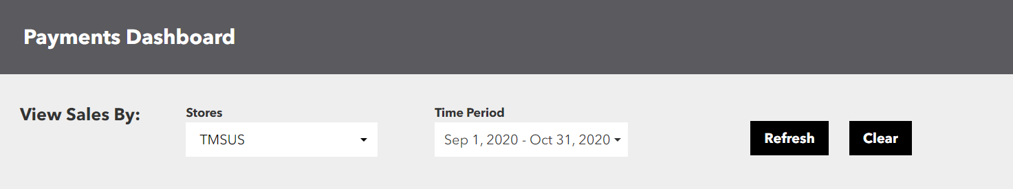
In the Dashboard, information you see is specific to the displayed Time Period and to the store or stores that are selected.
To view information for a selection of stores in a specified time period:
- In the Stores dropdown, make a selection of one of more stores. For more information, see Manage Multiple Stores.
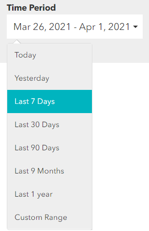
- Select a Time Period. The options are Today, Yesterday, Last 7 Days, Last 30 Days, Last 90 Days, Last 9 Months, Last 1 Year, and Custom Range. If you select Custom Range, use the calendar tool to specify a range of dates.

- Click Submit. The Dashboard displays information based on your selected criteria. The Stores Selected field shows your currently selected stores.
When you are viewing information for a time period that includes today, be aware that the data is refreshed every hour, which means there can be a delay after a transaction is processed by the Radial Payments Service before the transaction’s information is included on the Payments Dashboard.
When you use the Dashboard to compare today’s information to that of a previous day, remember that today’s data inherently includes only a partial day’s data, whereas data for days in the past include the full day.
Use Tooltip Help
Graphs on the Dashboard can display tooltip help with details for a data point.
To use tooltip help on a data point, hover over a colored element on the graph. After about one second, a tooltip displays details for the data point.
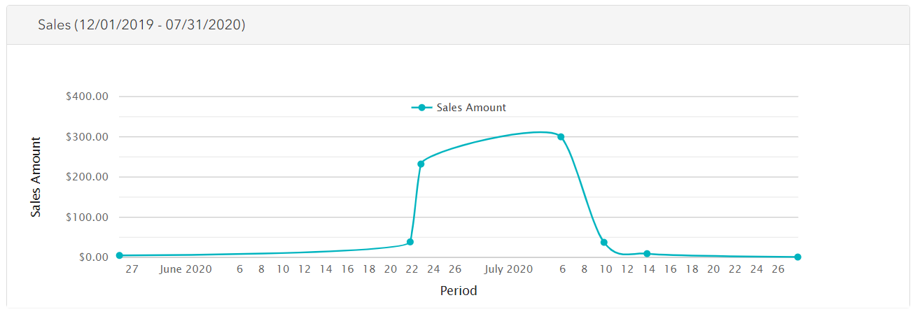
Sales
The Sales line graph shows daily sales volume in dollars for the days in the selected time period. Specifically, 'sales' are settlement requests sent by your organization to the Radial Payment Service.
Each dot on the graph represents one day. Hover over a dot to see a tooltip with the numeric value for the specific day. Because sales are processed in a daily batch format from the previous day, the date reflected in this graph will show as day +1.
If your time frame includes today, it will only include sales/settlements received before the nightly cutoff (usually around 2 a.m. EST).
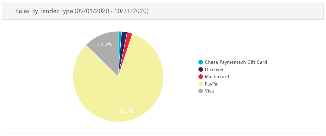
Sales by Tender Type
The Sales by Tender Type pie chart shows the percentage of value attributable to each tender type. Hover over a pie slice to see a tooltip with the dollar value for the tender type.
Note: Transactions processed using Apple Pay will be reflected in the actual tender used within Apple Pay (Visa, MC, etc.) and will not show as Apple Pay specifically.
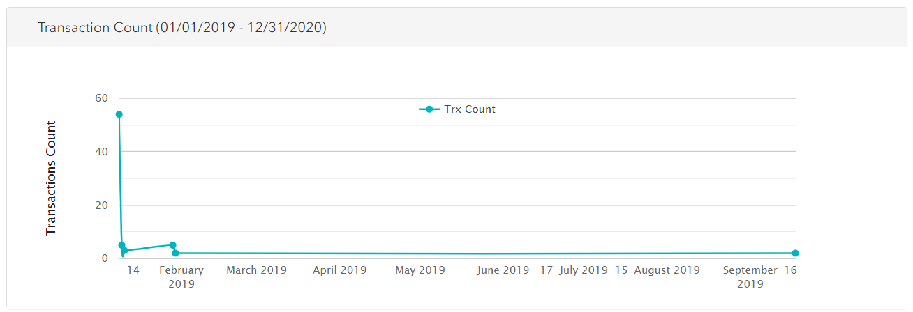
Transaction Count
The Transaction Count line graph shows the daily number of payments transactions for the days in the selected time period. Please note that there are usually multiple payment transactions for an order. An order may have an authorization, confirm funds, settlement, etc, each counting as a transaction. A Paypal order has at least 4-5 transactions.
Each dot on the graph represents one day. Hover over a dot to see a tooltip with the numeric value for the specific day.
If your time frame includes today, remember that today’s data reflects only a partial day.
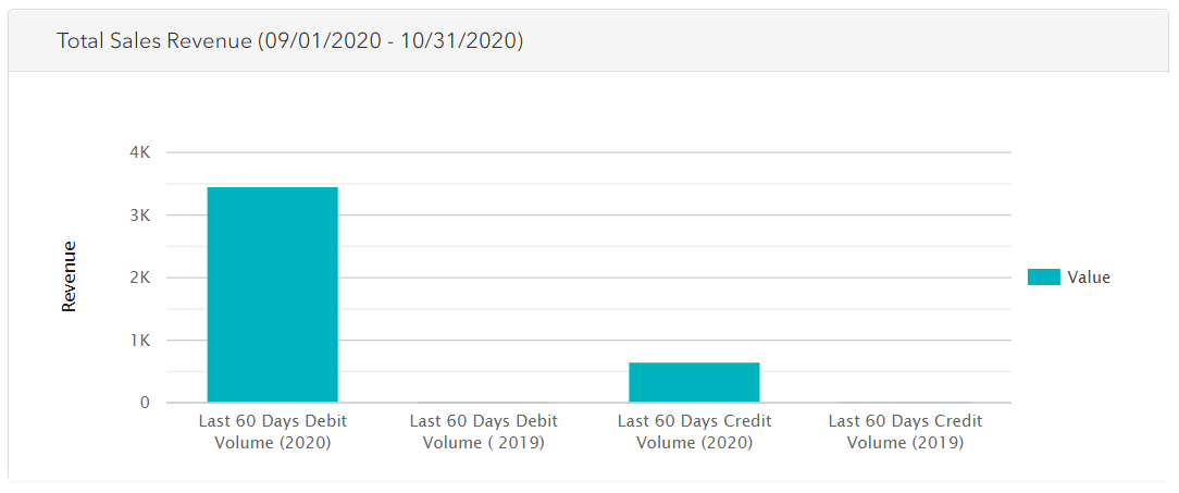
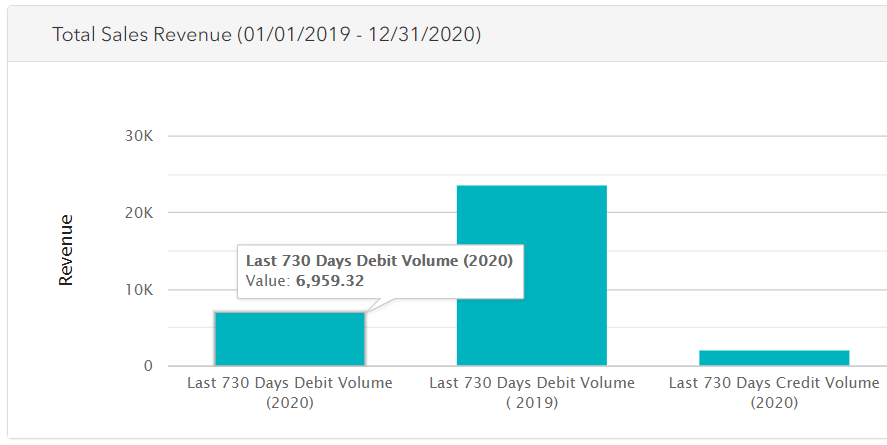
Total Sales Revenue
The Total Sales Revenue bar chart shows total value for debit and credit transactions in the selected time period. The four bars show total value for each of the following:
- Debit transactions (sales) for the selected time period
- Debit transactions (sales) for the previous-year time period, for comparison
- Credit transactions (refunds) for the selected time period
- Credit transactions (refunds) for the previous-year time period, for comparison